3 Quick Tips To Improve Your Funeral Home Website

Your website is something you should always be working on and adjusting. That doesn’t mean making little tweaks every day. But instead, regularly checking how your funeral home website is performing by making sure information is accurate and up to date, monitoring performance and traffic, and even testing how families respond to different things like calls to action (CTAs) or pop-ups and forms.
The Pulse
If you’re looking to improve your funeral home website’s design or functionality, make sure to check out our latest eBook 5 Ways To Improve Your Funeral Home Website.
In meantime though, here are three bonus quick tips to get you started, which aren’t included the eBook.
Make Your Website Navigation Clear
The purpose of a website’s navigation is twofold. First, it helps visitors navigate the site and locate where to find a certain page like preplanning resources or your general price list. Secondly, it helps search engines crawl the site so it can display pages from your site on search engine results pages when certain keywords are used.
When examining the navigation on your funeral home website, it’s always best to keep it simple. Try to avoid using buzz words if possible and tell the visitor exactly what they’ll find in the section. Your funeral home website’s navigation is a great place to include keywords. Not only does this improve the user experience of your website, but it also makes it easier for search engines to crawl and indicate the relevance of the page.

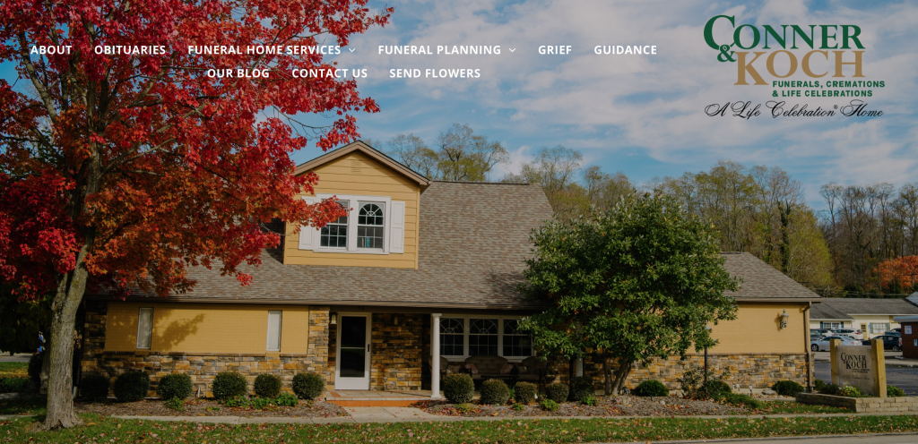
Take a look at the navigation for Conner & Koch Life Celebration Home. Their website’s navigation is clear and concise. As soon as you reach the home page, the sections are easily identifiable so that visitors who wish to review an obituary or send flowers know exactly where to click.
Avoid Carousels If Possible
Carousel ads are a great choice when advertising on Facebook. You can highlight multiple features of a product or service. Or just show different products and services available. But when it comes to having a carousel gallery on your funeral home website, there is much debate.
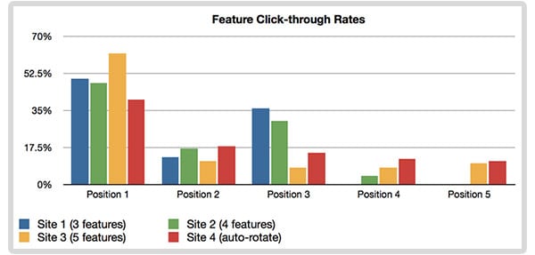
According to a study completed by Erik Runyon of the University of Notre Dame, user interaction with a carousel greatly decreases after the first slide. What his study found was that the vast majority of visitors to a website, rarely make it to the fourth or fifth slide in a carousel.

Now I know what you’re thinking. What if you just set the carousel to rotate through slides automatically? That has to improve the chances of a visitor seeing each slide right?. The problem with that though is that you could actually hurt your conversion rates by doing do.
According to conversion rate expert, Tim Ash.
“The human brain is hard-wired to notice the onset of motion, which makes rotating banners especially distracting. We literally cannot tune them out.“
While this can be both a good and a bad thing, you really just have to test if having a carousel is working for you and leading people to click to the different parts of your website you want. If you have one on your website, the best practice is to make sure the pages you want to prioritize are shown at the beginning of the carousel.
Offer Downloadable Content
Not everyone who comes to your website is in need of your services right away. Sometimes people are just researching and comparing the services available to them in their area. Or perhaps, the person has started to think about funeral preplanning and wants some more information.
While these types of visitors might not be purchasing your services today, that doesn’t mean you can’t start to nurture a relationship with them. By including free content on your website, you can use forms to capture their information when they want to download a piece of content like a pre-planning checklist or a guide discussing burial vs cremation.
When creating this free content, try to create something that will help you stand out from the competitors.

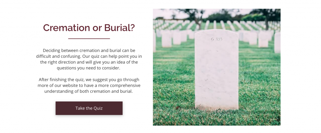
A great example of this is the burial vs cremation quiz offered on Colonial Funeral Home’s website. Rather than creating an ebook or handout, our team created this interactive quiz on their website. The purpose of this is so visitors can easily complete the quiz in a couple of minutes, find out what type of service is best for them, and then find out more about the service and options available.
Want more funeral home marketing tips?
Make sure to subscribe to The Pulse for a free monthly educational newsletter offering funeral home marketing and advertising tips and resources.

Tommy holds a Communications degree from Laurentian University and an Integrated Marketing Communications Graduate Certificate from St. Lawrence College. He is a Content Marketing Specialist at FrontRunner and focuses on producing engaging content that funeral homes can use to connect with families. In addition, Tommy crafts SEO content for clients and specializes in helping the general public connect with the death care industry as a whole.
