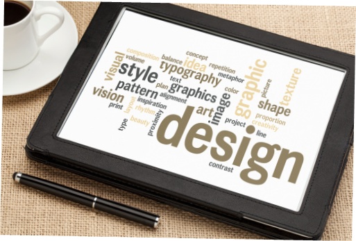
Both design and content are critical to attract and retain online visitors. They work in tandem to engage potential clients and re-engage existing ones.
I’ve pulled the FrontRunner Design Team together to pick their brains. The one very important thing to remember is that designing a funeral home website goes way beyond picking your favourite colour and throwing in your logo and a few pictures. The overall appearance of a website incorporates text, links, graphics, photography, colours, fonts, navigation, and scalability. All of these elements must come together in unison to present an attractive and professional looking website. If these elements are missing, website visitors are easily turned off and will look elsewhere.
The FrontRunner designers work with clients to create brand cohesion or, in simple terms, the same look and feel on all marketing materials, including the website. The brand includes many components such as the logo and particular colours, styles and images. Here are a few examples of some FrontRunner client custom designs.
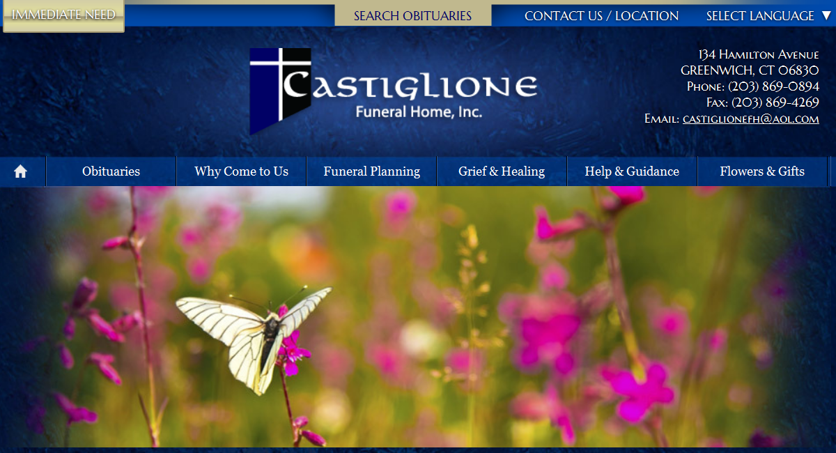
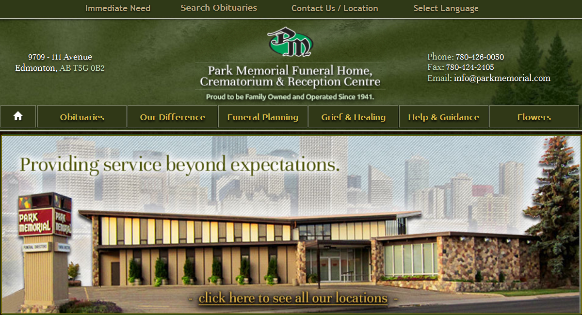
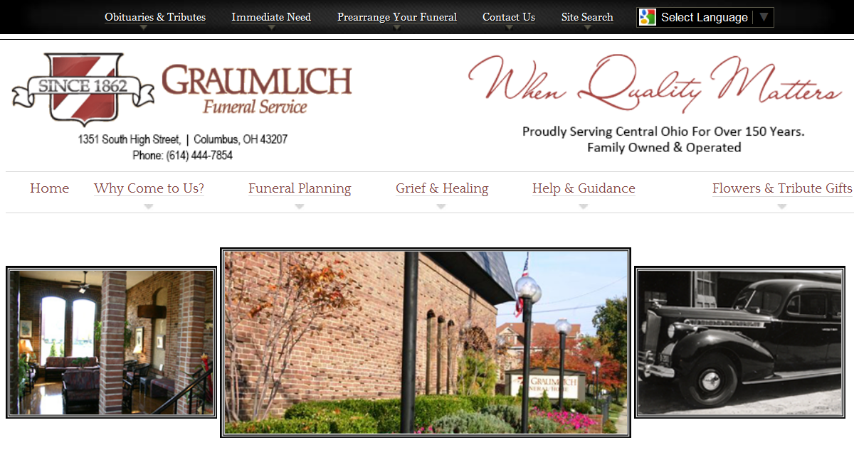
All are very different and as you’ll notice, the logo and images work to define the website and set them apart from the others. In order to achieve this professional look, designers need a couple of things from funeral homes to get started.
Logo: If you have one already, great! But, it needs to be a vector file. If you’ve never heard of that term, you’re not alone… it’s a design thing. There are two different types of graphic files:
- Vector – an image that’s created based on mathematical coordinates, which can be easily edited and scaled to any size. Vector files are normally in eps, ai or pdf formats.
- Raster – an image made of many hundreds or thousands of pixels (think photograph) usually in a jpg, gif or png format. Raster files can become blurry when enlarged so they are difficult to manipulate into a design.
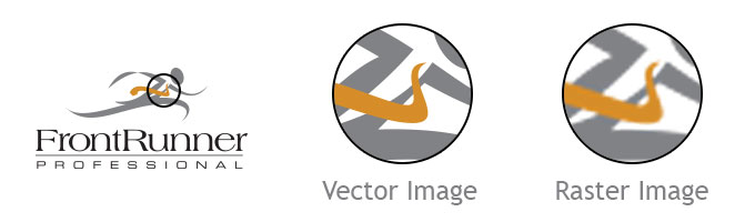
If you send a designer your logo in a vector file, you will make an immediate friend. If you don’t have it, ask the company that designed your logo to send you one. If you want to re-create or enhance your logo, or create a brand new one, contact your FrontRunner Success Coach who will work with the design team to make it happen.
As for images, high resolution photographs are a must. For example, it’s impossible to fit a 250×250 pixel image in a 500×700 pixel spot within a design without distorting it. Larger and professional photos also have a positive impact on the overall feel of a website.
Once the main design is in place, it’s then up to the website administrators to maintain the brand cohesion. While I may sigh when I see an improper use of a comma, designers gasp when they look at a design that fails. Web editors, in their efforts to add or change content, inadvertently manage to knock everything out of whack. It’s easy to do and thankfully, it’s easy to correct in order to restore harmony.
Here’s a brief list of the DOs and DON’Ts of web design:
DO
- Use the same font and font size on all pages
- Use a text size that isn’t too big or too small
- Bold and italicize (but don’t overdo it) to emphasize words or phrases
- Use clear, personalized and professional photos
- Use text and link colours that coordinate with the site colours
- Use the allotted space for content to avoid unnecessary scroll bars
- Ensure the website can be properly viewed on all monitors and devices
- Keep your company brand in mind with every key stroke
DON’T
- Use huge, red or green bolded text to draw attention to a section of the page; it will attract attention but not in a good way
- Use Times New Roman font (great for print; not so great for web). Georgia is just one screen-friendly font to use instead.
- Use a rainbow of text colours on pages unless your target audience is under the age of 3.
- Use upper case text unless you mean to SHOUT!
- Distort images while resizing them to fit on page
- Underline text that is not a link
- Use animated or blinking graphics
- Use graphics that overpower the text with their size or colours
- Overcrowd the main navigation with too many page titles
Your website design defines your online reputation. Just as your brand is important in your printed marketing materials, it’s vital to extend that consistency or cohesion to your website. If you need guidance or have any questions, the FrontRunner team is always available to help.