20 Stand-Out Funeral Home Website Designs from 2015
that Have People Talking!
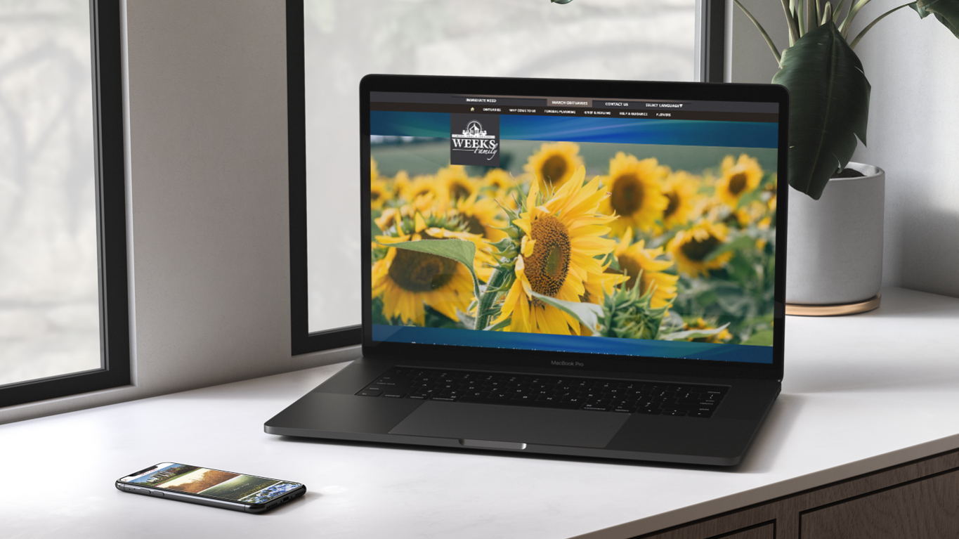
Approaching a new year often leaves us with a mix of emotions. We’re anxious and excited for the year ahead but at the same time we like to look back on the highlights of the past year and take some time to reflect on the positives. As it turns out, 2015 has been quite the incredible year for us here at FrontRunner. We launched our technology center workshops, hired lots of amazing new staff, and had a blast at MANY (probably too many) trade shows across North America, just to name a few. However, one of the year’s biggest highlights is keeping clients, old and new, smiling with a shiny new FrontRunner funeral home website!
Our clients come up with lots of creative ideas they have for their funeral home websites and challenged our designers and developers to create the best web and funeral home software products in the industry. There’s no better feeling than pushing that finished product live for the world to see and hearing the positive feedback from both clients and the families they serve. We want to showcase with you a few of this year’s funeral home website designs. We appreciate all of our clients who joined the FrontRunner family this year and are proud at the progressive approach they take with their business. Of course we can’t show all of the websites we’ve pushed live this year, but below are some highlights our team has chosen in no particular order. We look forward to helping many more funeral professionals in making 2016 their best year yet!
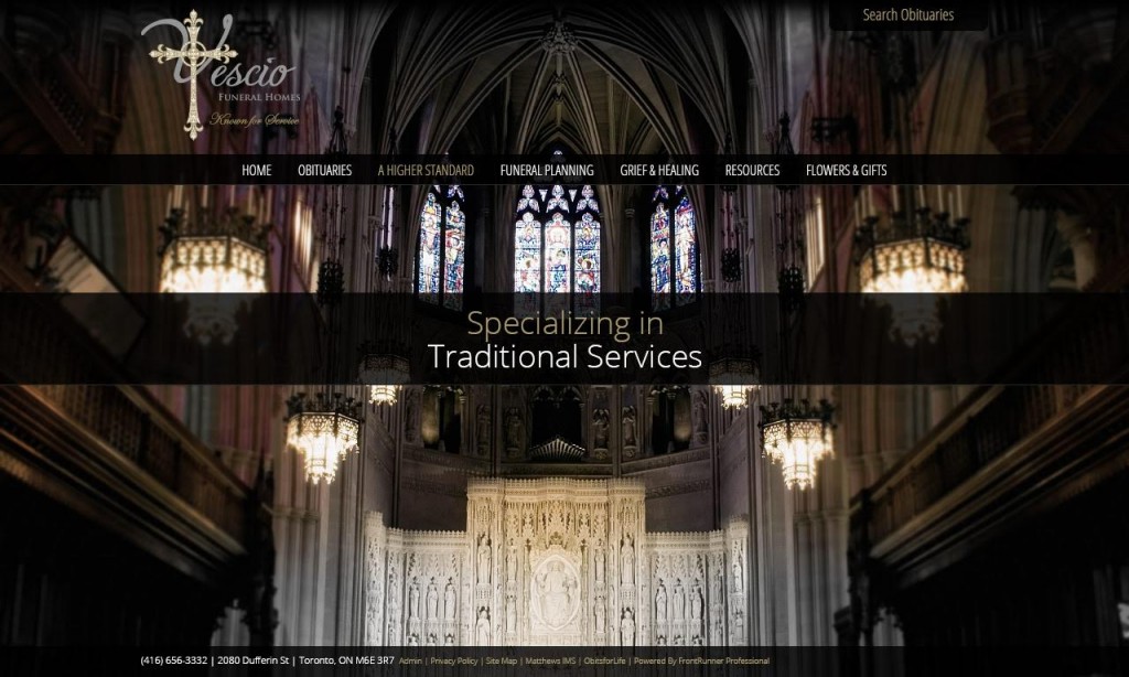
Vescio Funeral Homes – Toronto, ON
Vescio’s funeral home website is one of the newest websites which FrontRunner has created. It has a unique homepage and a very sleek, modern design. How beautiful is this funeral website design? Amazing job to our design team here. It is absolutely stunning!
Visit their website here: www.fratellivesciofuneralhomes.com
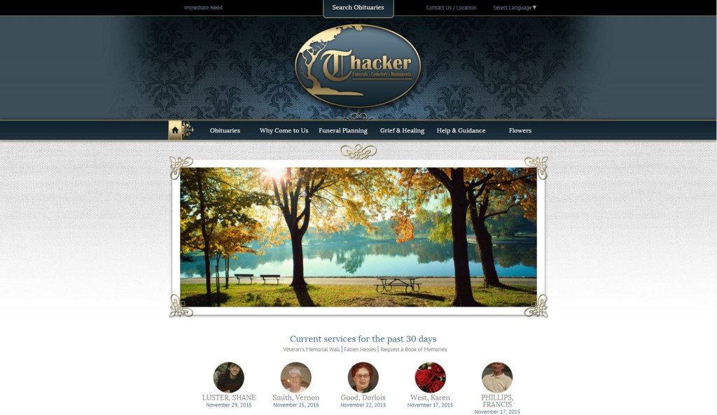
Thacker Memorial – Pikeville, KY
Thacker Memorial’s website uses one of FrontRunner’s classically loved layouts. It’s accentuated with some beautiful detailing and gold accents throughout.
Visit their website here: www.thackerfuneralhome.com
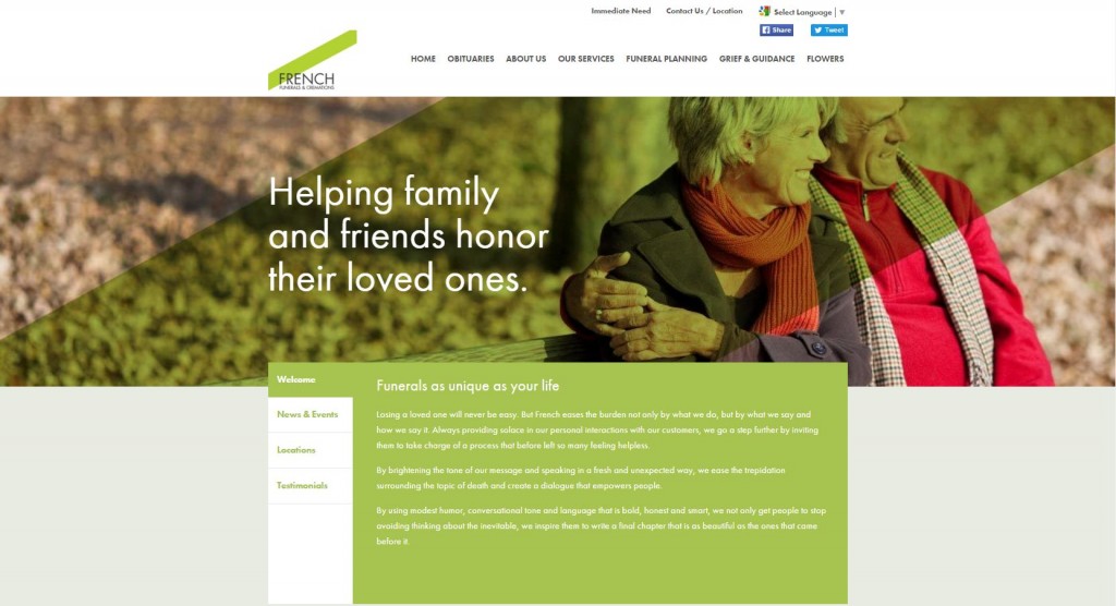
French Funerals & Cremations – New Mexico
French Funerals & Cremations are very well-branded and this shines through on their website. They have some really progressive marketing and wanted a website that reflects this.
Visit their website here: www.frenchfunerals.com
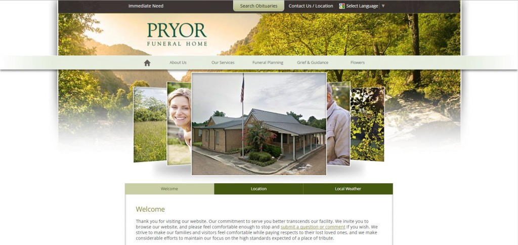
Pryor Funeral Home – Calhoun City, MS
Pryor Funeral Home’s website is very neat, lush, and all-around visually appealing. They have a good mix of visuals and text which makes for a great user experience.
Visit their website here: www.pryorfuneralhome.com
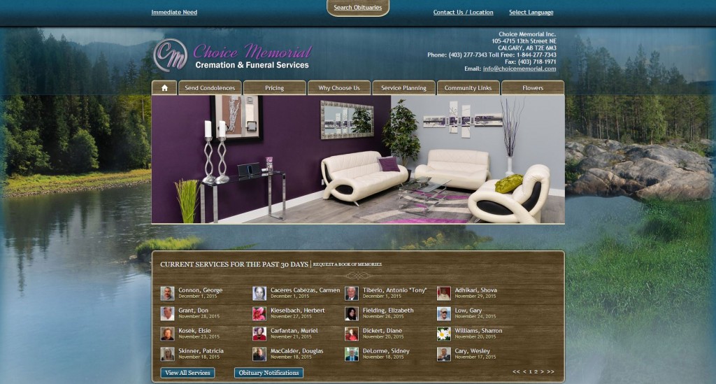
Choice Memorial Cremation & Funeral Services – Calgary, AB
Another firm who does branding right, Choice stands out with its white and purple colors. Their modern website reflects the modern interior of the physical location itself. Check out those white and purple couches though! How amazing are those?
Visit their website here: www.choicememorial.com
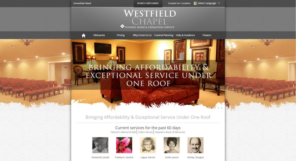
Westfield Chapel Funeral Home & Cremation Service – Springdale, AR
When you mix Westfield’s facility pictures with a FrontRunner design, you get one sophisticated looking website. Westfield Chapel has some great calls to action and they even proudly display their pricing on their homepage. Shout out to Colby and the Westfield Chapel team on a great job!
Visit their website here: www.westfieldchapel.com
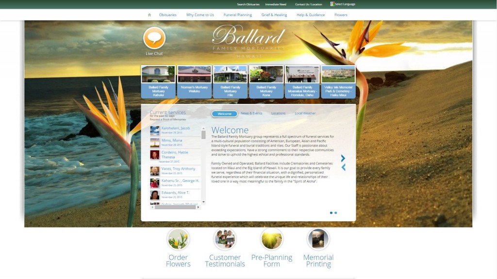
Ballard Family Mortuaries – Hawaii
Ballard Family Mortuaries’ multi-location website is structured in a way that does not take away from the simple navigation. They have also implemented a “Live Chat” feature to provide families with even more ways to reach out to them. Anyone want to take a trip to Hawaii after seeing this Caribbean-inspired design? We do!
Visit their website here: www.ballardfamilymortuaries.com
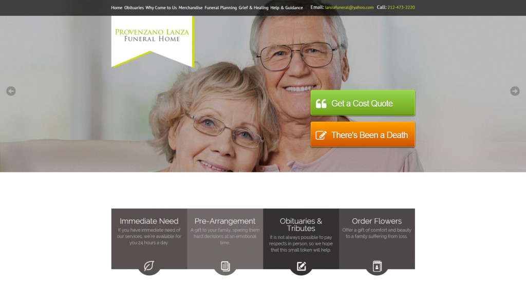
Provenzano Lanza Funeral Home – New York, NY
The real stand-outs with Provenzano Lanza’s homepage are the call-to-action buttons and unique navigation icons. This design helps them lead families to the content that the firm wants them to see. We’ve been busy tracking their website traffic since their new look – and wow, the results are out of this world. Great job Provenzano team and the FrontRunner crew!
Visit their website here: www.provenzanolanzafuneral.com
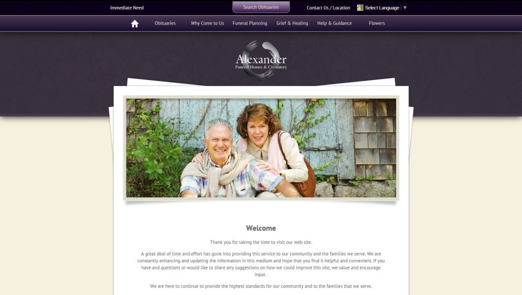
Alexander Funeral Homes & Crematory – Wilson, OK
Alexander Funeral Homes uses one of FrontRunner’s modern designs which features a simple eye-catching layout and a larger obituary slider.
Visit their website here: www.alexanderfuneralhome.org
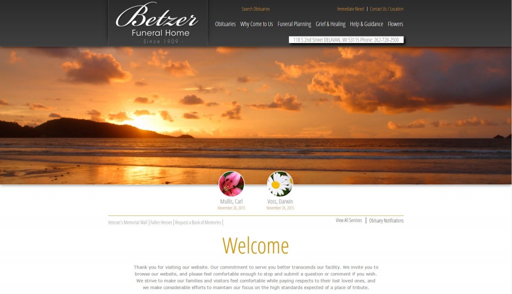
Betzer Funeral Home – Delavan, WI
Highlight features of Betzer’s website include their unique obituary display and a navigation menu that follows users as they scroll down the site.
Visit their website here: www.betzerfuneralhome.com
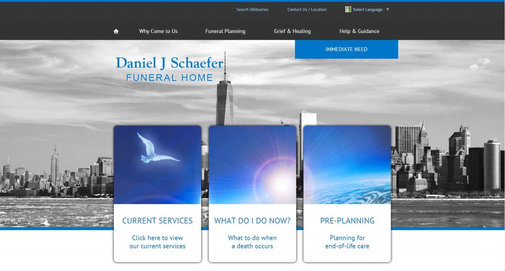
Daniel J. Schaefer Funeral Home – Brooklyn, NY
The Daniel J. Schaefer website showcases one of our newer navigation structures as well as the large service listing visuals. The colors of this website in particular are also appealing for visitors.
Visit their website here: www.danieljschaeferfuneralhome.com
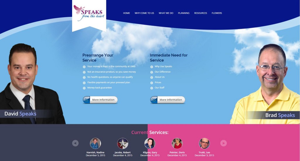
Speaks Legacy Family Chapels – Independence, MO
Brad came to the FrontRunner team with some very specific ideas in mind – and this was the amazing end result! Vibrant, welcoming colors and plenty of navigation options and calls to action as soon as you enter the site. Speaks’ website is a great example of what being user-friendly is all about.
Visit their website here: www.speakschapel.com
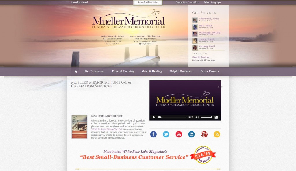
Mueller Memorial – Minnesota
Mueller Memorial’s homepage takes full advantage of online marketing. Video, social media links, and even a downloadable e-book are prominent elements of the homepage to ensure the FrontRunner site is being used to the best of its ability for capturing leads.
Visit their website here: www.muellermemorial.com
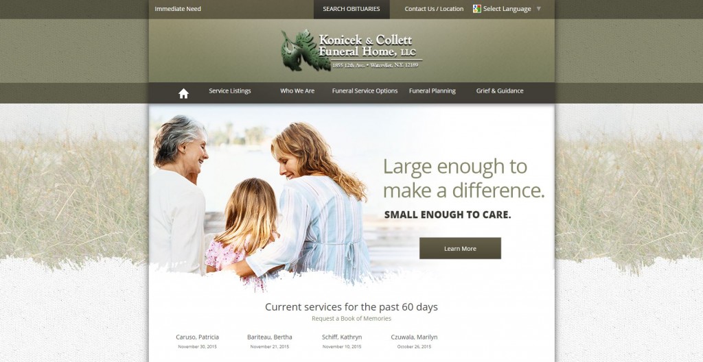
Konicek & Collett Funeral Home – Watervliet, NY
Konicek & Collett’s website uses the Long Grass Theme, one of our most popular funeral home website themes and for good reason. Its welcoming colors and centralized layout make for a great experience for families.
Visit their website here: www.konicekandcollettfuneralhome.com
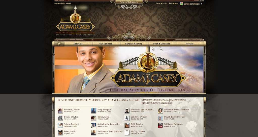
Adam J. Casey Funeral Services – Chicago, IL
Some firms like to showcase their community proudly through their website, and Adam J. Casey’s does a great job of this. From the graphics to the website’s design itself, Adam J. Casey’s site grasps the Chicago community which no doubt resonates with families.
Visit their website here: www.adamjcaseyfs.com
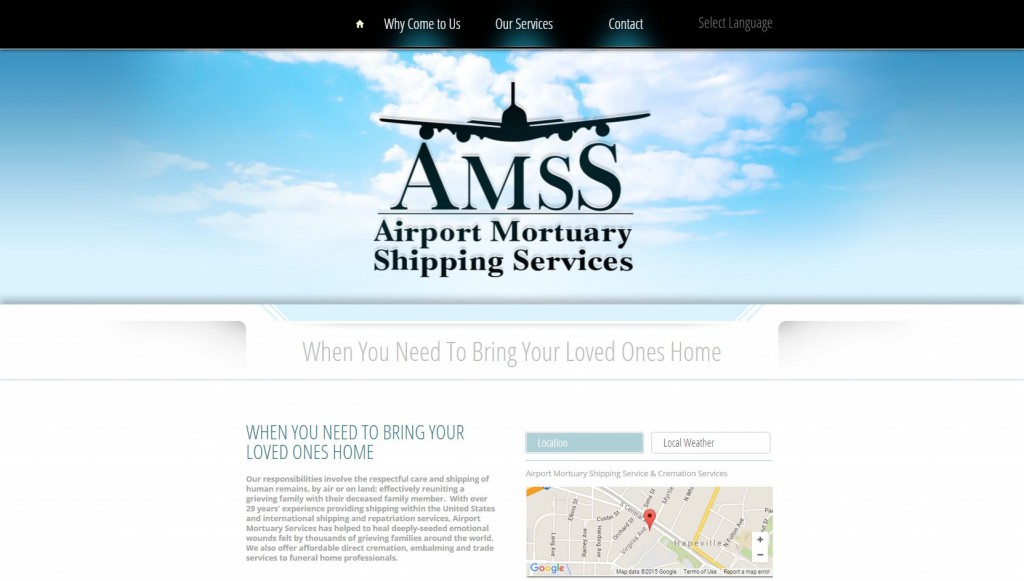
Airport Mortuary Shipping Services – Atlanta, GA
Airport Mortuary’s web design certainly reflects their services. The logo on the sky backdrop helps tie together the rest of the site’s colors and set a heavenly atmosphere. This was a fun website for our team to design!
Visit their website here: www.airportmortuaryshipping.com
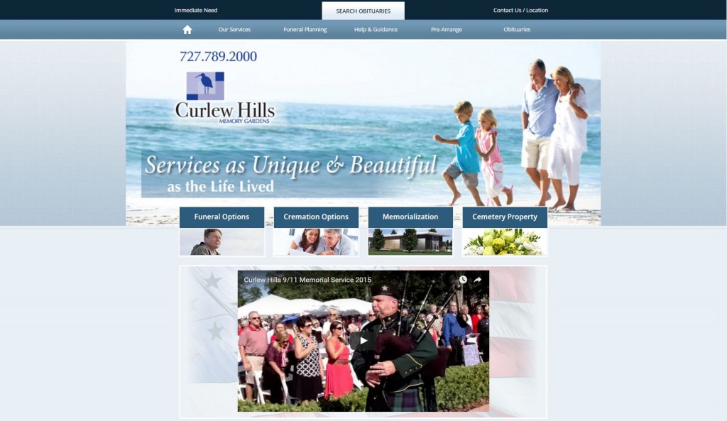
Curlew Hills Memory Gardens – Palm Harbor, FL
Curlew Hills’ website has a nice look to it that goes perfectly with the funeral home’s logo. They have good use of video on the homepage and you definitely get the Floridian feel from their website.
Visit their website here: www.curlewhills.com
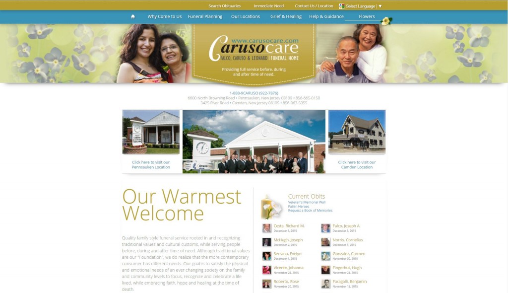
Falco, Caruso, & Leonard Funeral Home – New Jersey
Caruso Cares’ website is light, vibrant, and displays all relevant info to users as soon they land on the homepage including both location options.
Visit their website here: www.carusocare.com
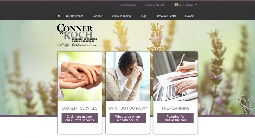
Conner & Koch Funerals, Cremations, & Life Celebrations – Bellbrook, OH
This website uses our “Lavender Theme”. With large buttons on the homepage for their main calls to action, it’s a great theme for leading traffic to where you want. Conner & Koch also have a blog and lots of social media integrated into their funeral home website.
Visit their website here: www.connerandkoch.com
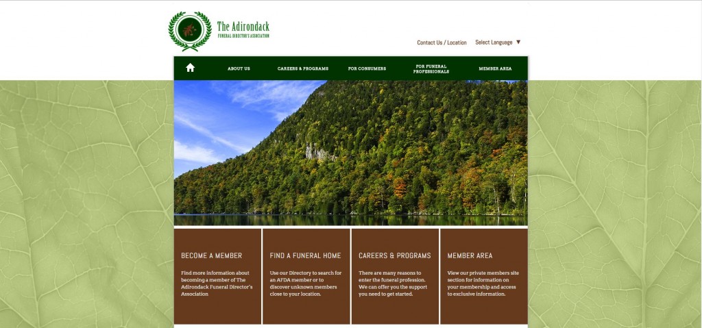
Adirondack Funeral Director’s Association – Schuylerville, NY
This website is for an association rather than a funeral home, showing you just how versatile FrontRunner site’s can be. Adirondack FDA’s website is simple, crisp, and gives users all the desired information upfront.
Visit their website here: www.afdaonline.com
Thank You for Making 2015 Our Best Year Yet!
While we wanted to take some time to recap just a few of our clients funeral home website designs, we also want to take a minute to thank each and every FrontRunner client. Whether you are a website client, funeral home management client, or an integrated Pulse Business System client, thank you for making 2015 one for the books. We could not have done it without you!
Looking to Improve Your Funeral Home Website for 2016?
If it is time to move into a completely responsive, mobile friendly funeral home website, just like some of the designs you saw above, contact the FrontRunner team! We will get you into a brand new FrontRunner website or upgrade your current FrontRunner website design to a new and improved look! You can browse through all of our funeral home website designs or get a custom one created unique to you. And with the 12 Days of Christmas Holiday Deals running now (hint, hint: keep your eyes peeled for website deals), there’s no better time to make your firm not just look good online in 2016, but generate a ton of new business from it.
Here’s to a great year of funeral home websites and to an even better one in 2016!

Interesting to see how these showcased sites for funeral homes are mostly lightweight viewing, right off the bat. I own an SEO and Marketing company so seeing these is a breath of fresh, so to speak. I mean no offense. My focus is getting my clients ranked in Google and your post here has shown me things can be different than they were before, in web terms. Not everything associated with death has to be dark or gloomy. THAT is what gets noticed. Positive differences. Thank you, Travis for showing a business owner a how-to.
– James, at EPick Marketing.