The Top 5 Reasons Your Firm Needs a Responsive Website Design
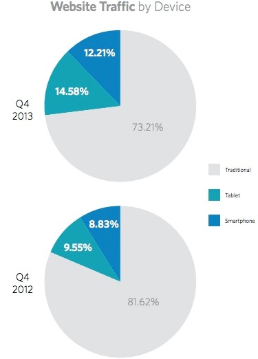
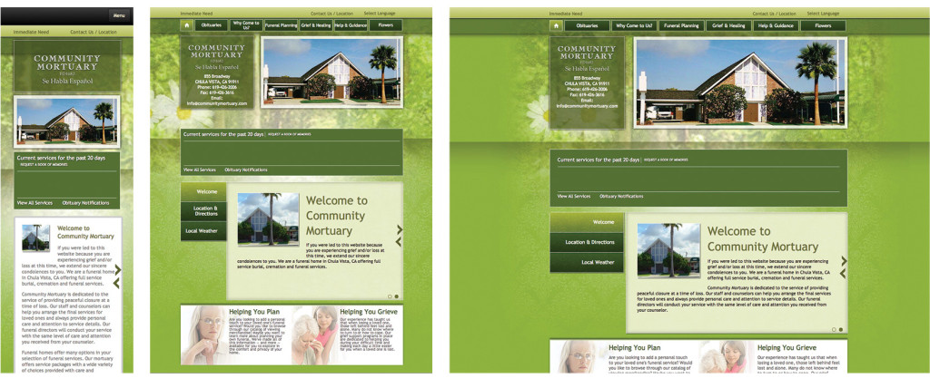
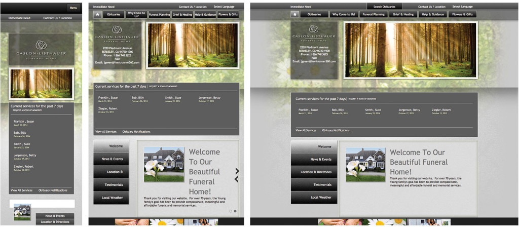
 Responsive website designs are growing in popularity – and necessity – simply because of the increasing number of people accessing websites from mobile devices. Responsive technology is different than mobile technology though because it provides one site for every screen and creates an optimal viewing experience on smartphones, tablets, laptops, and full-screen computer monitors.
How are responsive websites built?
Most websites are what’s called ‘adaptive’; they are built using multiple fixed width layouts. This compares to responsive websites, which are built using multiple fluid grid layouts that are more flexible and adjust automatically depending on the platform or screen resolution. No matter the size of the device or the monitor, responsive websites look the way they were intended.
FrontRunner responded to the market trends in 2013, and began building responsive websites for our funeral home clients. We wanted to ensure all clients could easily provide an improved experience to their web visitors.
Why this matters: The Top 5 Reasons Your Website Needs to be Responsive
#1 – Creates a user-friendly experience
There’s nothing more annoying for website visitors than having to resize, pan and scroll to find the information they want. Most of us have no patience – we want information at our fingertips when we want it. If we have to work too hard to find it, then we go on to the next website.
Responsive technology aligns the content – scales the text and images – so everything is accessible at any resolution.
#2 – More and more people are viewing your site on mobile devices
According to Pew Research, as of January 2014:
- 90% of American adults had a cell phone
- 58% of American adults had a smartphone
- 32% of American adults owned an e-reader
- 42% of American adults owned a tablet computer
Mobile trends continuing to evolve; 27% of online visitors went online via their mobile device in 2013 compared to less than 19% in 2012.
 Since all signs point to mobile use surpassing desktop use (not to mention what’s in store with devices of the future), it’s only logical to ensure your website responds seamlessly for every user, no matter the device.
#3 – One site instead of two
Mobile websites are totally functional but require double the effort. Each mobile site requires a separate template and url or sub-domain. If you make necessary changes on your main website, those changes don’t automatically populate the mobile site.
Managing one site instead of two saves your firm both time and money; having multiple versions of websites requires more work to update and extra development fees.
#4 – Google approved
Google recommends a responsive web design when it comes to mobile configuration and refers to it as a ‘best practice.’ Responsive websites have one URL and html code; this makes it easier for Google to crawl and index content rather than repeating the steps on a separate mobile site. The technology also reduces load times because no redirection is required (ex. ‘view mobile site’) and creating a welcoming experience for search engines can help your site rank higher in the search results.
#5 – SEO Friendly
Further to above (making Google happy and avoiding double efforts), you can focus all your funeral home’s Search Engine Optimization efforts on a single website. All the work you do to boost your rankings will apply no matter the device. By consolidating your SEO efforts to a single site, you can spend less time duplicating your content and more time focusing on effective optimization strategies.
For more information about responsive technology and how to improve the overall experience for your web visitors, contact your FrontRunner Success Coach today.
Sources: searchenginewatch.com / hubspot.com / forbes.com / Monetate.com / pewinternet.org


This is a wonderful read I love this type of reading they always keep me up to date with the latest trends and business practices
I believe that a good website should not only be good looking and responsive but also highly converting.
this article is great! Almost 50% of online traffic is through mobile devices if your site is not mobile friends you could be loosing 50% of your potential customers.
I appreciate that rules are helpful and active.