20 Funeral Home Website Designs That Stood Out In 2016

Funeral home websites took a gigantic step forward in 2016. As a result of mounting consumer demand for more refined online experiences, many funeral industry professionals had no choice but to update their digital brand this past year. For us at FrontRunner, it has been a pleasure to work with the firms that get excited about their funeral home website and digital marketing strategy.
Things move a mile a minute around here. Whether we are working on the latest update to our award-winning funeral home software or attending one of the many industry trade shows, progress never stops. While it can be all to easy to put our heads down and forge forward to build a better funeral industry, one business at a time, there is something to be said about looking back and celebrating shared successes. For this reason we have put together a list of the 20 funeral home website designs that really stood out from the pack in 2016. Some of these sites are brand new, others have been around for a while but collectively they set a great example for other firms.
We could not be more happy to have been a part of these great projects. And though we cannot share every website in the FrontRunner Family, these are some favourites chosen by our staff. In no particular order, please enjoy the best of the best in funeral home website designs.
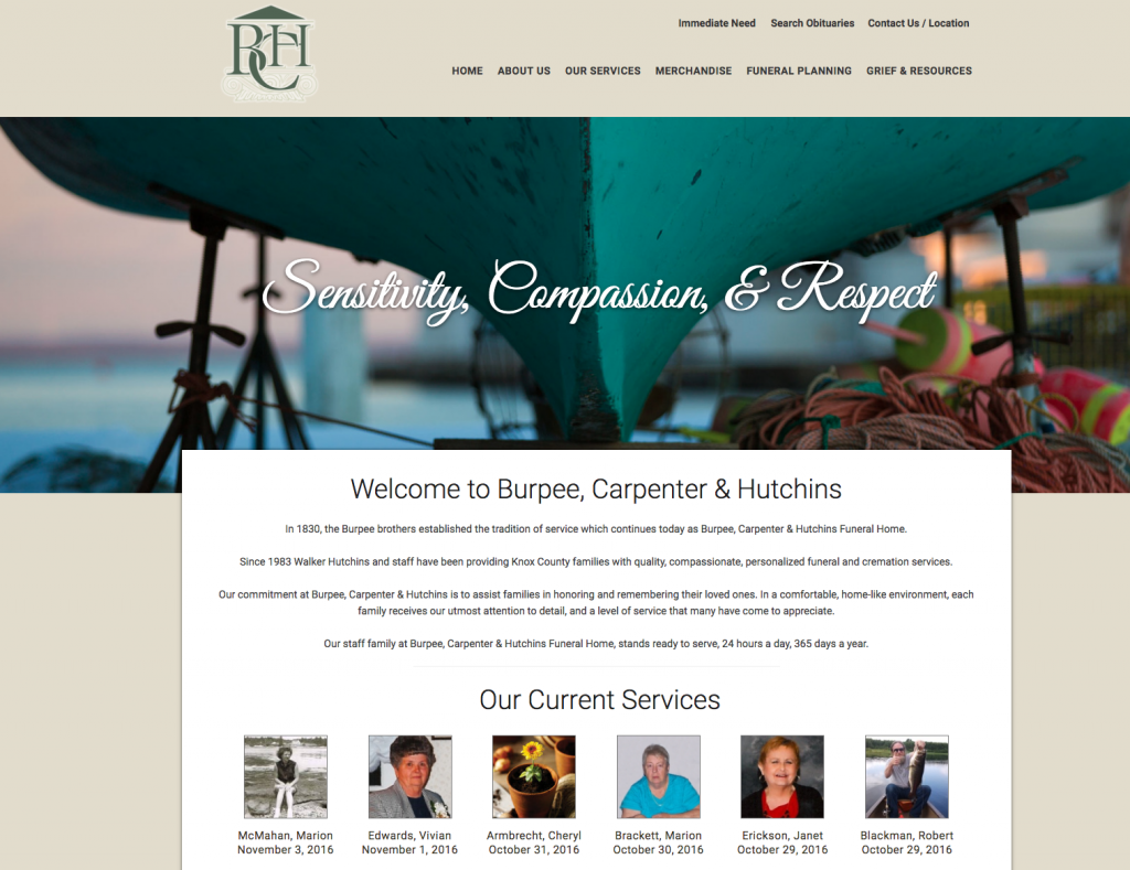
Burpee, Carpenter & Hutchins – Rockland, ME
This funeral home website is a perfect mix of fashion and function. Without going overboard on information or design, their pages properly capture the character of Rockland, the coastal New England town where the funeral home is located. With a simple, easy to navigate layout, this site serves as a welcome landing spot for families. Check it out here: bchfh.com.
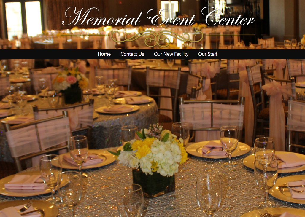
Memorial Event Centre – Edinburg, TX
This website is as dynamic as it is beautiful. Serving as a venue for more than just funerals, the Memorial Event Center site showcases the facilities and provides useful information to visitors. With simple navigation and a no-nonsense site map, it provides a truly down-to-earth user experience. Take some time and have a look at their website: memorialeventcenter.com.
Noblin Funeral Service – Belen, NM
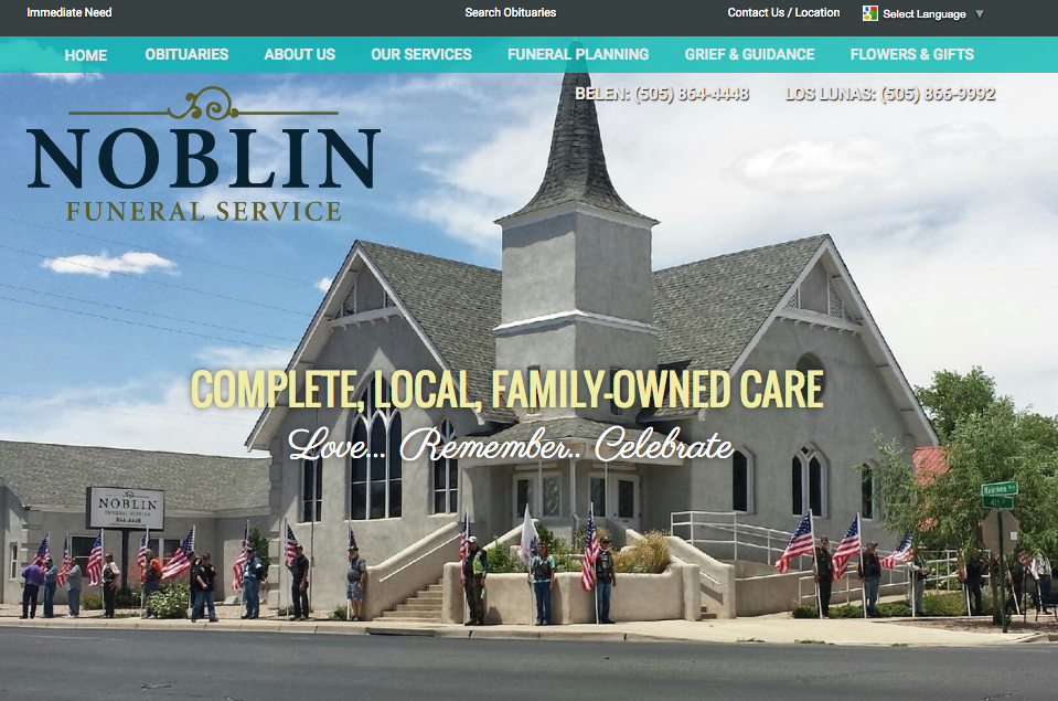 noblinfuneralservice.com is a perfect example of a bright, colourful and simple funeral home website. Mixing eye-catching vibrance with responsive design, it is easy to see why this funeral home website is being talked about more and more. They also deserve a shoutout for doing a great job of highlighting their team!
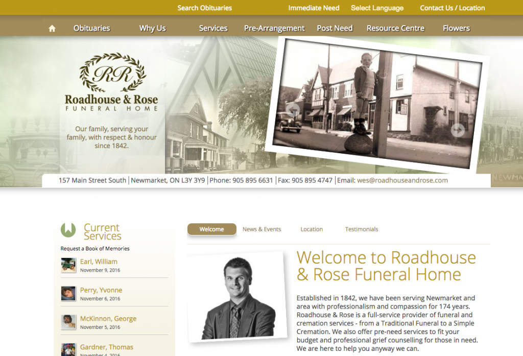
Roadhouse & Rose Funeral Home – Newmarket, ON
Classic does not mean dated and roadhouseandrose.com is a shining example of that. With an extremely user friendly site, Roadhouse and Rose Funeral Home has built a great online reputation on a well established relationship with families of the Newmarket area. Another point of success is the emphasis on contact information and how to get in touch with the funeral home staff.
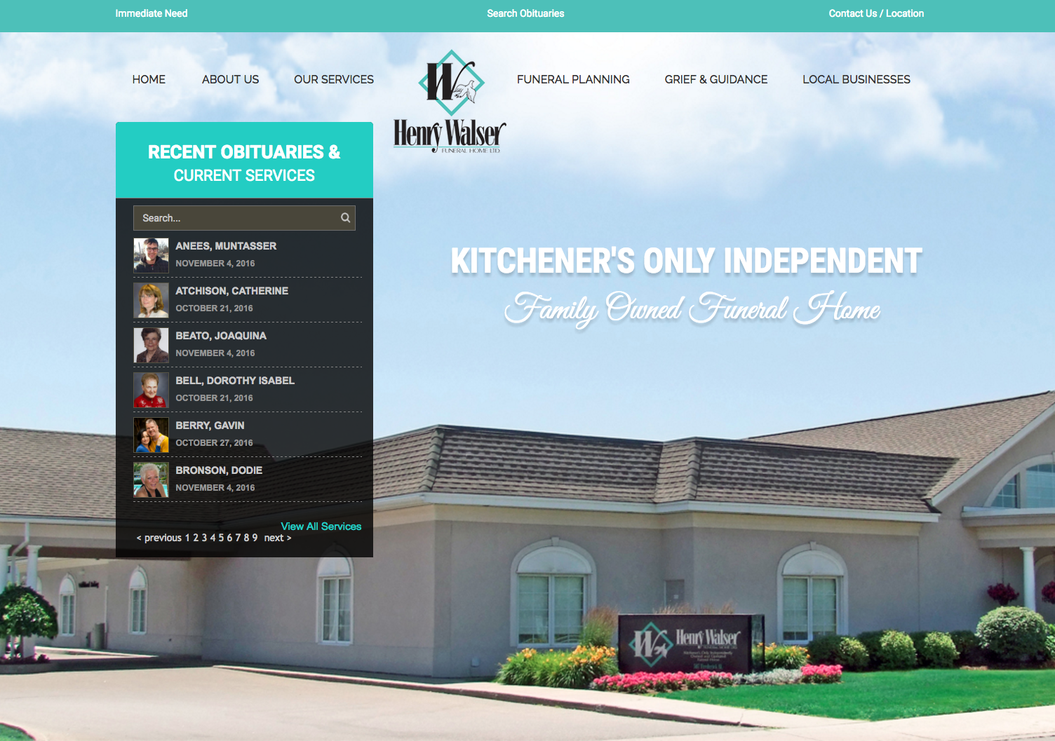
Henry Walser Funeral Home – Kitchener, ON
Playing to the growing trend of image based layouts, this funeral home website mixes traditional navigation with a modern, clean and sharp design. In addition, the website does a great job of showcasing the beautiful facility and family roots of the business. Check out some more of what they do right at henrywalser.com.
Avatar Cremation Services – Palm Beach, FL
Avatar Cremation Services is one of our most modern funeral home website designs and offers a user experience that is unique within the funeral industry. The service options are obvious and the navigation is smooth. What more could you want? This site also sets a great precedence for providing pricing and other valuable information in a tasteful way. If you want to see more of this great site visit avatarcremation.com.
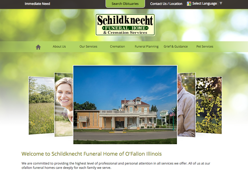
Schildknecht Funeral Home & Cremation Service – O’Fallon, IL
This is another example of a funeral home website that pairs classic navigation with a clean, modern design. Also, this site has great social media integration, including a great feature that feeds obituaries to their funeral home Facebook page. Check out more of their website by visiting schildknechtfh.com.
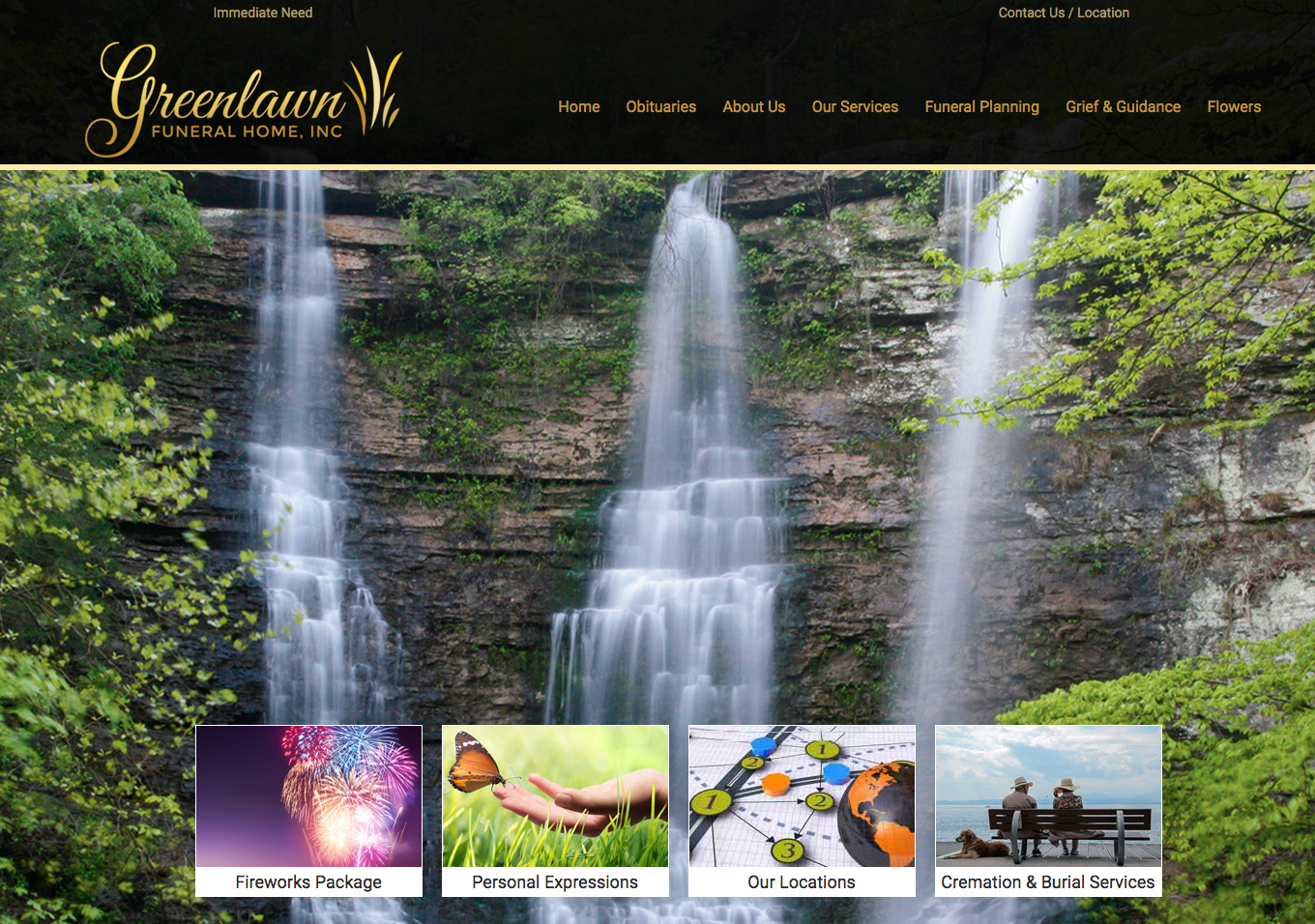
Greenlawn Funeral Home – Springfield, MO
For multi-location firms, having a great funeral home website is an important part of building a recognizable brand in different communities. Have a look at greenlawnfuneralhome.com for a great example of how to promote your quality services, multiple locations and provide helpful resources with one great site!
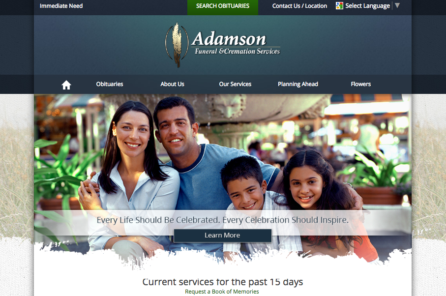
Adamson Funeral & Cremation Services – Greeley, CO
Sometimes less is more. With the simple navigation of the adamsonchapels.com website, families are able to find the information and services they need without any fuss. With clear and colourful call-to-actions all over, it is not a stretch to describe this funeral home website truly family-friendly.
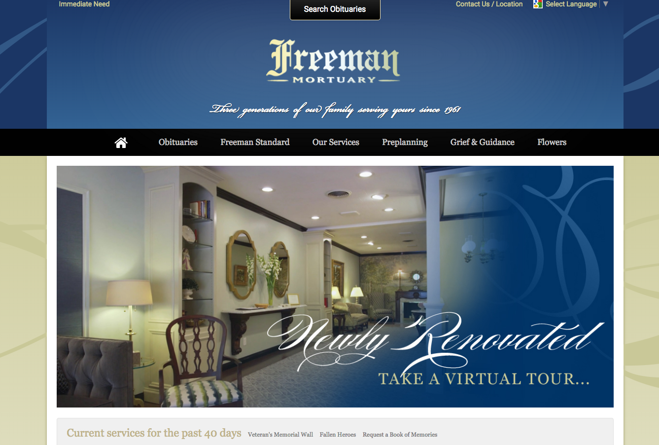
Freeman Mortuary – Jefferson City, MO
With all of the modern designs on this post, it is time to pay homage to something a little more traditional. The Freeman Mortuary website is everything visitors want and expect from a funeral home website. Featuring great images of the facility and an in-depth profile of the staff, freemanmortuary.com truly promotes the funeral home in an authentic way.
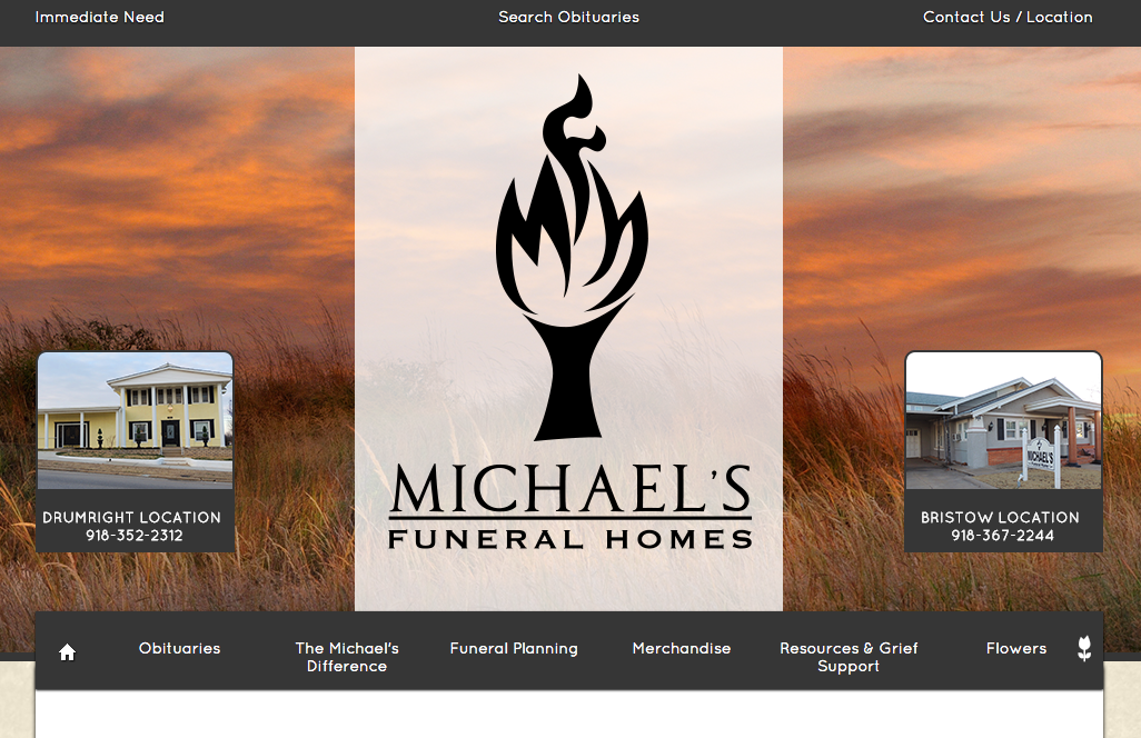
Michael’s Funeral Homes – Drumright, OK
In 2016 some funeral businesses made a move towards building stronger, easier to market brands. michaelsfuneralservices.com is one of those firms. With a visually appealing logo, bright images of their facilities and consistent messaging, Michael’s website breaks the mould in more ways than one. Do yourself a favour and explore what these guys stand out from the crowd.
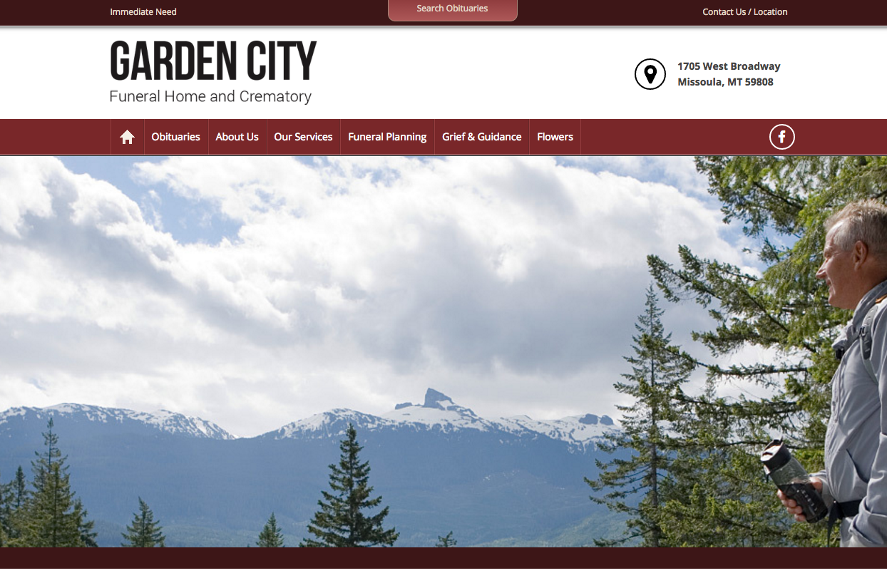
Garden City Funeral Home & Crematory – Missoula, MT
This website is a personal favourite of mine. Setting out to track down the best of the best, the Garden City Funeral Home and Crematory website stood out immediately. The images are bright and do great justice to the beautiful Montana landscape that serves as a backdrop for the funeral home’s impeccable facility. If you want to see more of what makes this site a beacon of modernity, visit gardencityfh.com.
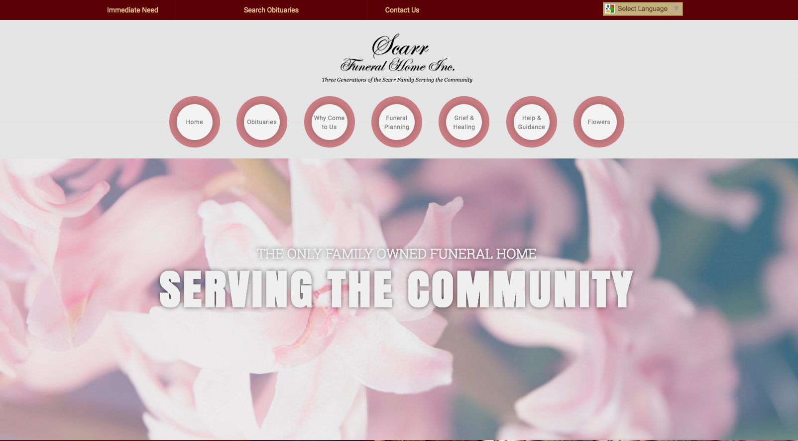
Scarr Funeral Home – Suffern, NY
One of the main features that makes this site impressive is the simple and intuitive navigation that offers families immediate answers to pressing funeral service questions. The right information is easy to find and additional resources are readily available should the site be explored in greater depth. After all, that is what great funeral home website design is all about. Check out how its done at: scarrfuneralhome.net.
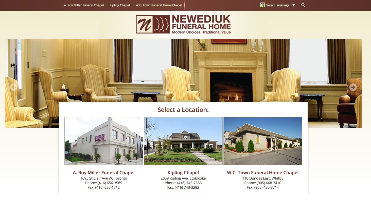
Newediuk Funeral Home – Toronto, ON
Another great way to showcase multiple locations is to put them front and centre. This website does a fantastic job of making the facilities seem warm and inviting. The use of video on the homepage is something other firms should explore moving forward. Sometimes families do not have time to read all of your information. Using video is a great way to tear down the barrier between visitors and your vital information. See how they do it: newediukfuneralhome.com.
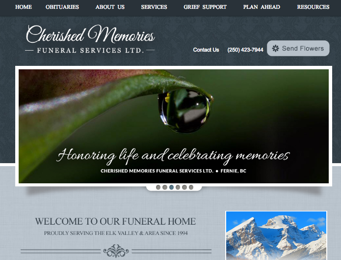
Cherished Memories Funeral Services – Fernie, BC
cherishedmemoriesfs.com offers a more alternative look to visitors. The layout of this funeral home design is sharp, classy and modern. Throughout the website, call to action buttons and contact information are readily available and conveniently placed. In addition to being user friendly, this site has great content and a well put together site map.
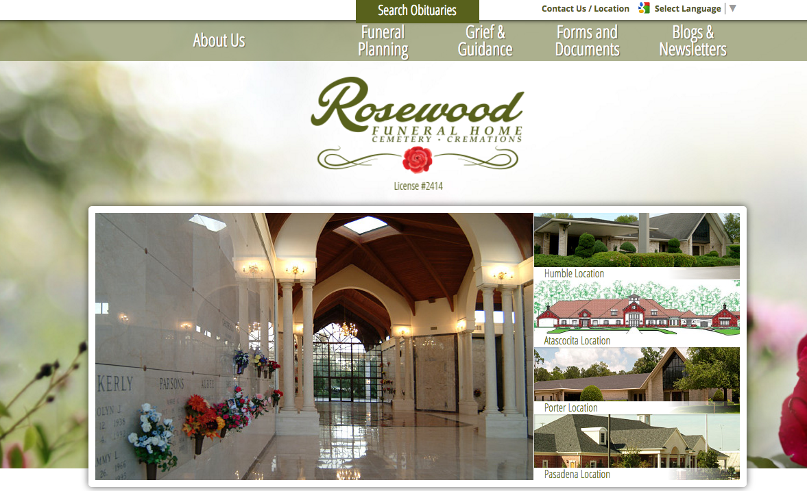
Rosewood Funeral Home – Humble, TX
Just like the Newediuk Funeral Home website, rosewoodfuneral.com does an excellent job of putting their breath-taking facilities on display. What makes the Rosewood site different is the availability of different resources such as blog posts, newsletters, social media feeds and event posting. From a quick look around this site it is apparent that they are proud to be involved with the communities within which have locations.
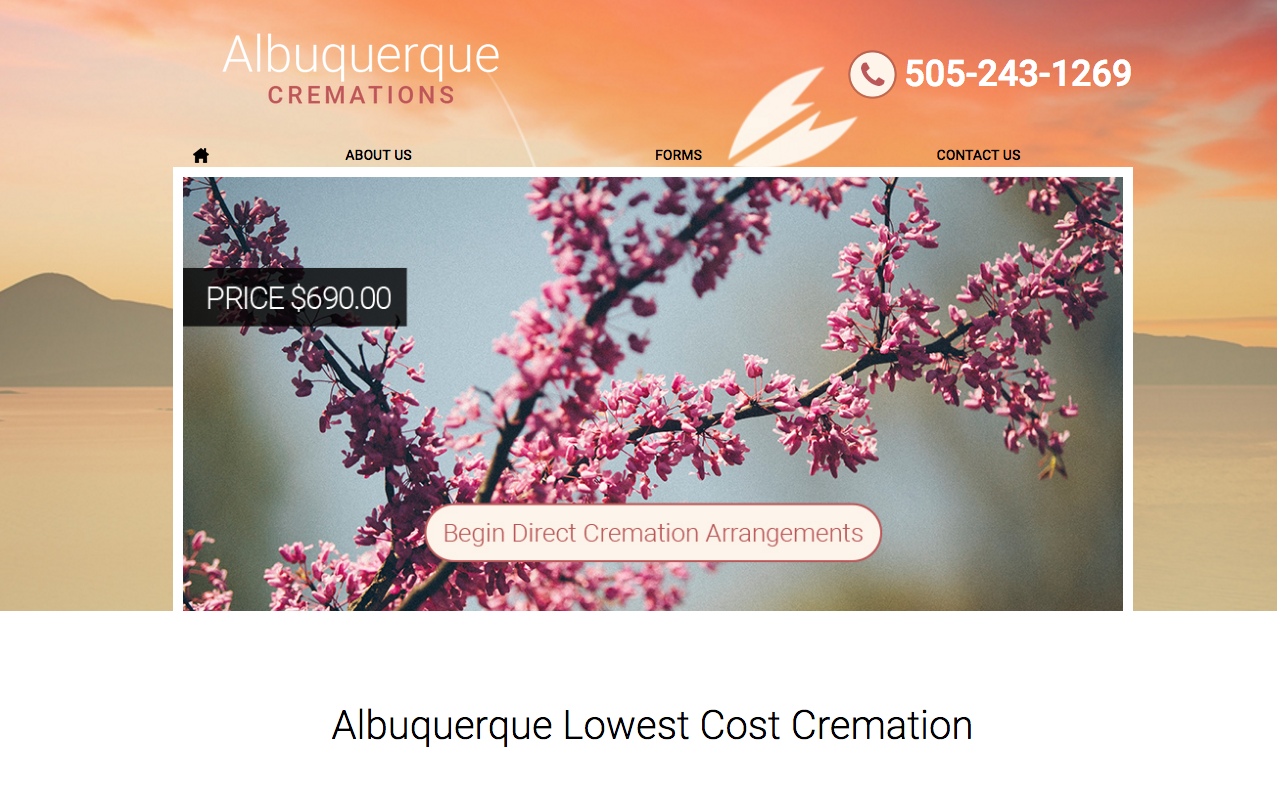
Albuquerque Cremations – Albuquerque, NM
2016 was a big year for cremation. It is now the most chosen death-care option amongst American families. For funeral homes and cremation businesses alike, this news should serve as a wake up call that cremation is an integral part of any death care firm. When it comes to stand- alone cremation businesses, albuquerquecremations.com has done an excellent job of building a clean, crisp and visually appealing brand. Check out this website if your firm is looking to hop on the cremation trend.
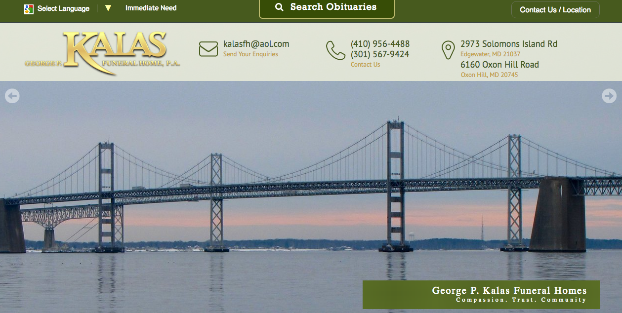
George P. Kalas Funeral Homes – Edgewater, MD
If you are proud of the community you serve, there is no better way to demonstrate that pride than to place images of your locality front and centre on your website. In the case of kalasfuneralhomes.com, images of their Maryland communities serve as the design foundation for the whole site. Paired with lots of colour and intuitive navigation, the George P. Kalas site is a new take on what funeral home websites can look like.
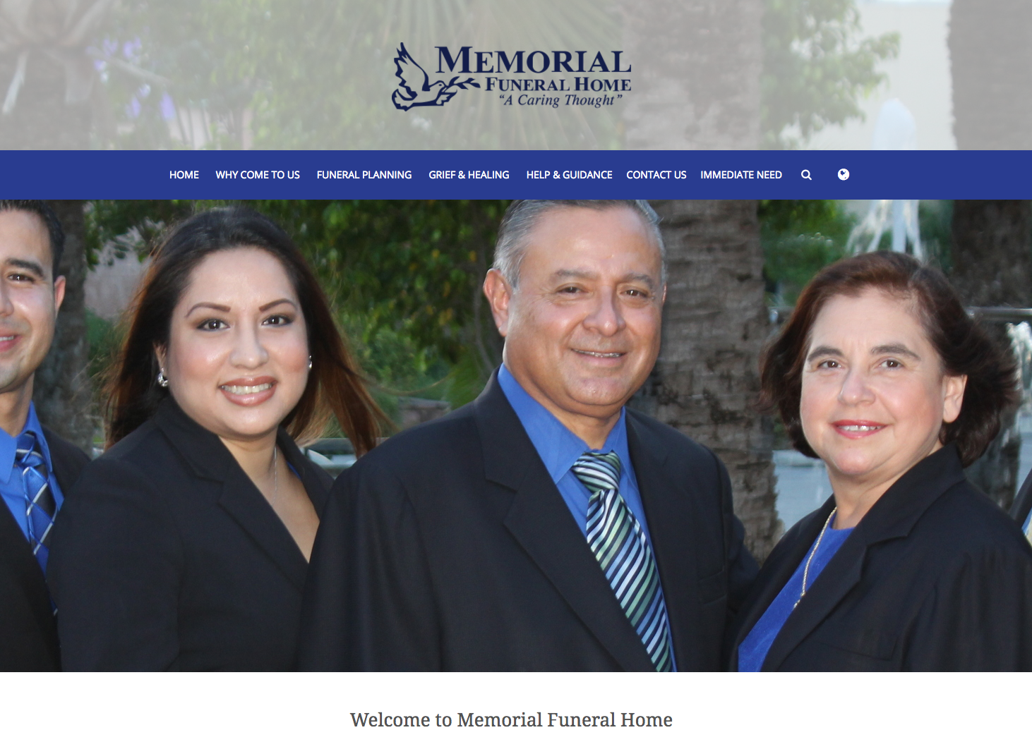
Memorial Funeral Home – Edinburg, TX
Sometimes design is less important than placing your family centre stage. For family owned and operated funeral homes, memorialfuneral.com is a great example of letting family-oriented values and a welcoming environment do the talking. Making families feel at home by simply visiting your website is a great goal that every funeral home should have in mind when designing or making changes to their existing site.
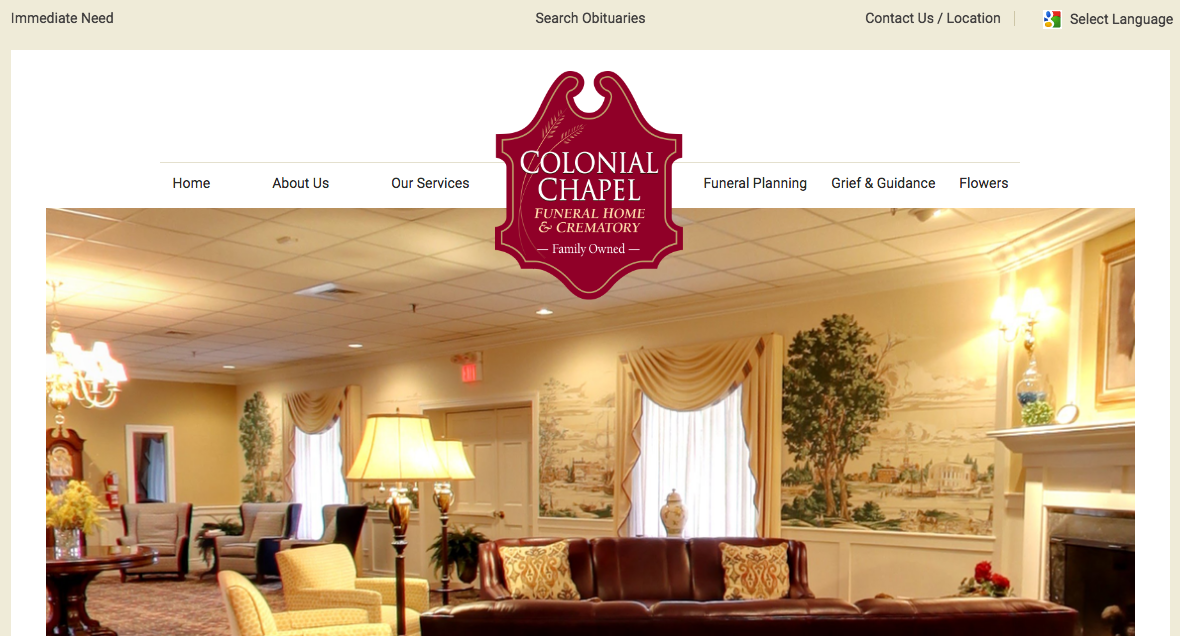
Colonial Chapel Funeral Home & Crematory – Orland Park, IL
Of all the websites on this list, colonialchapel.com does the best job of showcasing the funeral home itself. The slideshow on the home page rolls through several high-quality images that make the facility look appealing, welcoming and well suited to the needs of families. By spending even a little amount of time on the site, you will understand the funeral home, what they do and how they help families. At the end of the day, that is what a great funeral home website is about.
If you are interested, have a look at the 2015 list, 2017 list & 2018 list for more great funeral home websites we have created over the years.
Step Up Your Funeral Home Website & Digital Presence in 2017!
This post should, if nothing else, serve as a source of inspiration for funeral professionals who want to build better businesses for the future. It is no longer sufficient to simply be online. It is possible to have a website, be on social media and still be behind the eight ball. Being the go-to funeral home is about staying top of mind. With the amount of advertising, marketing and information people consume on a day-to-day basis, you have to stand out and be distinct. In short, be memorable.
These days this it is nearly impossible to make a great first impression unless you have a great funeral home website, engaging social media and a marketing strategy to get ahead and stay ahead of your competition. While this may all seem a little daunting, imagine how 2017 could be your best year yet. If you want to know more about stepping up your funeral home website and digital presence in 2017, I know some people who can help you get started.
Brandon is the Marketing Communications Manager at FrontRunner Professional. He holds a Social Sciences degree from McMaster University and a Graduate Certificate in Integrated Marketing Communications from St. Lawrence College. His creative writing and innovative ideas bring new life to the company, FrontRunner’s clients and funeral directors world-wide.

[…] 20 Funeral Home Website Designs That Stood Out In 2016 intended for Garden City Funeral Home Missoula Mt Size: 1120 X 730 | Source: blog.frontrunnerpro.com […]